With Steven Spielberg’s remake almost out, the 1961 original still feels thrillingly contemporary, a tough act to follow
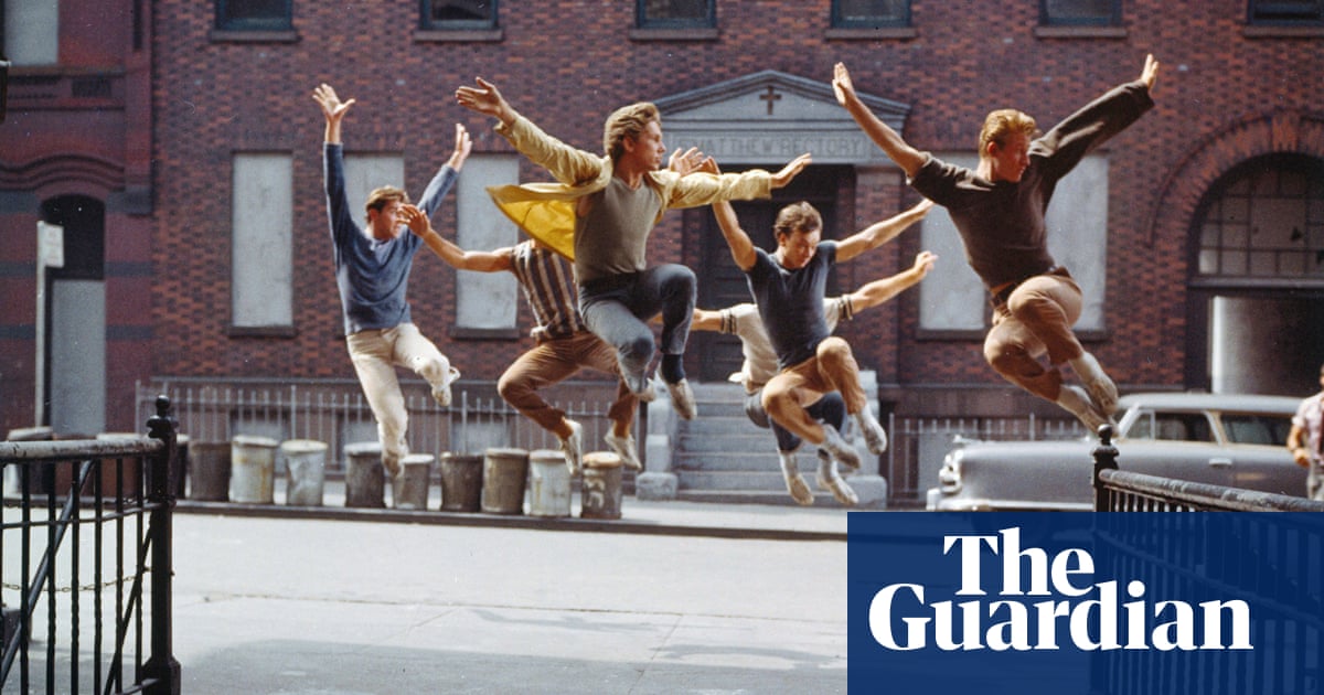
It’s the opening credits that do it right away. Following three eerie whistles over a black screen, West Side Story explodes into a full screen of poster-paint colour – shifting from orange to red to magenta to royal blue – as Leonard Bernstein’s four-minute overture brassily clatters into action. Over the colour, a stark design flourish: seemingly random brigades of parallel vertical black lines, only coalescing at the overture’s end into the tip of Manhattan, viewed from the air, cuing a vertiginous bird’s-eye montage of
New York City in motion. That chipper yet chillingly disembodied whistle returns; by the time we finally see a human face, six coolly riveting minutes has passed.
This whole title sequence – from the graphics to the aerial photography – was visualised by Saul Bass, the distinctive graphic designer then favoured by such aggressive stylists as Alfred Hitchcock and Otto Preminger. It still seems, perhaps even more than anything that follows in West Side Story, sleekly and breath-catchingly modern: a coup of expensive minimalism at the outset of a splashy
Hollywood production. That was no accident: in 1961, United Artists set out for the film to be something bracing and new in the movie musical, an industry staple that was looking increasingly out of step with a youth culture turning toward rock’n’roll.